Data for dummies: 6 data-analysis tools anyone can use

I’m a big fan of measurement, metrics and visualisations. I’m not a big fan of the amount of work it can take to set up those metrics. So I was excited back in 2013 to find an article listing six tools to help visualise data, my original post is below, and the original article I referenced is still online.

Five years on and the tools are mostly still around.

  1. BigML
    The company still exists and provides comprehensive data analysis, visualisation and predictions. There’s strong integrations with other tools and programming languages. They’re aiming at the corporate market with enterprise pricing options. There’s still a free option and a subscription option for individuals but their focus seems to be more at the company scale.
  2. Google Fusion Tables
    Disappeared? I suspect some of the data features are still available, but the tool itself has been retired.
  3. Infogram
    Makes infographics in a really simple way, but need to upgrade for any downloads. I so want this tool at work though, I made the infographic scorecard on the right in a matter of minutes.
  4. Many Eyes
    Doesn’t seem to be a stand alone product any more, but has been absorbed into IBM’s data tools, that’s fine, but IBM focuses on the corporate market – and is often at the pricier end of the market in my experience.
  5. Statwing
    Statwing was bought by Qualtrics in 2016, it remains a stand alone tool with the same focus on statistics, you’ll get insights into data, be able to apply statistical tests easily but the output isn’t as designed as some of the other tools.
  6. Tableau
    As luck would have it I now have access to the subscription version of this at work but have yet to play with it. It’s a powerful tool for visualising data and you can wander through the public gallery to see what the possibilities are – including a visualisation of the shape of national happiness. The great thing is that you can always drill down into the data.We will be doing some stakeholder analysis early next year and I think this tool will be a great way to visualise the results.

Five years since my original post and I’m still geekily enthusiastic about data visualisation tools.


I’ve spent about an hour playing with these tools, I’m loving Statwing, and will use it to analyse some of the data we’ve got on adoption of new technology. The Infogram tool also has potential to help present data in a more appealing way.


Image: data

iPad Revisited

The iPad was announced in January of 2010, and launched in April. I was scathing. I couldn’t see what it was for, there was a lot it couldn’t do and I thought the name was terrible. Six months later I bought one, and I still have it. It’s still limited, but as a portable home entertainment centre it works well.

But it’s funny to read how negative I was about it. Mind you I wasn’t alone, Gizmodo, NY Times and Jezabel also saw the same issues.

Here’s the original post.


So the iPad was finally announced after a run of rumours over the last month or two. It won’t be launched until March/April, but there’s already a fever of anticipation on twitter, with about 1000 tweets per minute.

As far as I can tell from the launch video the iPad = kindle + iTouch – iTunes wrapped up in Apple’s high design ethic.

There are already big theories about what it will do, including making higher education irrelevant. The scenario described is more or less using iPad as a tool for eLearning – but eLearning is already used in masses of university and executive education that I don’t see having a new tool as an obvious game changer. If Apple can get enough of the educational material online then perhaps it will transform educational publishing – that is not the same thing as higher education.

So what will it transform? It’s finally a competitor for Amazon’s best selling Kindle, and it’s priced to compete with Kindle, sort of. Kindle is at 259USD and the iPad starts at 499USD, there’s a quality difference and then there is the usual “apple premium”. So although Kindle has already developed a market share, and developed agreements with publishers to ensure a steady stream of new content, they might be pushed to improve the reading experience.

I suspect the transformation will hit the publishing industry and the web/design industries. Both will push the boundaries of current web design to create content – including video and apps – that will be worthy of the iPad – because it is a thing of beauty. The flow of content might follow the example I wrote about earlier this month regarding Digital Magazines.

There are issues, lots of them; some, like the lack of Flash and limited browser, can change relatively easily. But the biggest we-are-all-12-years-old-again issue is the name, calling this iPad just shows they have too many boys in their marketing department. Women immediately connect the name to menstrual pads (see list of twitter trending topics above). Ignominious start for something billed as “the best web surfing experience”.

Short was Good

Back in 2010 twitter was taking off, and there was a real art to constructing a witty informative tweet in 140 characters. Part of that art was using URL shorteners. I wrote about them.

Pretty soon after I wrote about them companies started using them automatically, and there were URL unpackers – so you could see what you were clicking on and avoid clicking on a dodgy link. So twitter used t.co as a URL domain root, making life on twitter easier.

Last year Twitter doubled it’s character limit, and excluded URLs and Hashtags from the count.

URL shorteners still exist but they seem quaint now, I haven’t used one in years. It seems funny to think of the effort that went into some of those early tweets.


Short is good?

So you’ve only got 140 characters to write wittily and get your point across AND  you have to add a URL!? The simple answer is to use a URL shortener, but which one?

There are a lot to choose from, bit.ly, is.gd, tinyurl.com to name a few. Or perhaps you’d like to build your own as Coca Cola have done.

It needs to do more than give you short URLs, it needs to be fast and it needs to be reliable.

Now there’s a way to monitor which URL shortener is the most reliable thanks to Dutch company Watchmouse.

So far today all those monitored are operating normally, but in a full month’s analysis the company found that Facebook’s shortener was the slowest by far.

I use shorteners for posting on twitter, that last URL to lifehacker is 93 characters long, the one to Watchmouse’s blog is 111 characters, leave no room witty commentary in a twitter post. Is.gd took both to 18 characters leaving me 122 characters in a tweet.

However some people are bothered by shortened URL as you can’t see what the destination is and where the URL will take you. Which is smart security thinking. But there are tools for this as well, firefox offers several add-ons, but if you’re not on firefox or you’re behind a firewall that won’t allow you to install the add-on then there’s a site that will expand the URL, called “untiny.me

Using a URL shortener saves 93 characters
display the original URL from a shortened URL

images: shorts, skirt Eurobike 2009 | babes / CC BY 2.0


It’s My 10 Year Anniversary

I started this blog 10 years ago.

I’ve changed jobs three times, ended relationships, lost friends, visited a dozen countries, changed industry twice, moved to a new house in a new city, learnt loads, made new friends in that time and the blog has remained constant.

To celebrate I’m reposting a few posts from previous years and commenting on what I got wrong (ipad), how stuff has changed (URLs) and what I got right.

I started this as a way to explore and write about the innovation I was seeing all around me working in digital/communications. As I explained in my first post

I want to write about ideas relating change in business, new technology and communication; only ‘idea’ seems so big and sweeping and life changing. Ideas belong to the ivory towers, the philosophers, the educators. So I chose the word “meme” instead.

Despite that intention my most viewed post ever was one about adding green to your twitter profile during the Iran revolution.

Here’s what I’ve written about over the ten years.

I’ve sustained this blog because I like writing, and I am fascinated by I’m writing about. Here’s some practical tips about how I get it done.

  1. Capture your writing ideas. I usually start a draft post for future use that I can add ideas, images and resource links to as preparation for eventually writing a post.
  2. Think ahead. I usually plan the subjects I want to write about about a month ahead and spend some time creating header images, which is the fun part.
  3. Set aside regular writing time. For me it’s Sunday morning, and I can combine reading up on my work areas with writing blog posts.
  4. Find a sustainable rate of posting. That’s two posts per week for me, usually one is in depth and one is simpler.
  5. It’s a hobby. So I don’t put pressure on myself to get it done if it’s not feeling like fun. There have been months when I’ve written 20 posts and months where I haven’t managed any. But I’m still writing after 10 years. Might be time to develop the habit into a book.

image champagne


Modular Content

If something is modular more pieces can be added to it, or replaced, yet the thing still functions. Think of lego bricks that can be used and reused to build everything from a pirate ship to the Death Star to an the Art of the Brick. Some companies have made a business model out of this, it is exactly how Fairphone have designed their phones to be made up of interchangeable, replaceable, components.

What about our content?

Very often traditional communications departments separate teams by the audience, so you have media relations, internal communications, external communications, investor relations, sustainability, corporate branding. Each team produces their own content, even though the stories have the same facts behind them and need to be somewhat consistent.

Modern communications departments are transforming and the new approach is called a newsroom approach, where all potential stories are discussed and assigned to a communications expert – a reporter – who is responsible for the creation of all the content relating to the story for all audiences. So one person might lead the production of a short video interview with an expert and a post for the company’s internal collaboration platform for internal audiences, a press release for the external channels, and an FAQ for media enquiries.

But lots of content is evergreen, meaning that a manufacturing company knows they’re going to say something about safety every month, a consumer brand knows they’re going to campaign around father’s day every year, and a listed company knows there will be quarterly reporting on company performance.

So what if we turned the content around and produced assets that could be combined into content, essentially content becomes data.

There’s a line in Steve Krug’s excellent book “Don’t make me think” that talks about creating content. Someone stole borrowed my copy so I’m going to misquote him… “we write content for the web like we’re creating great treaties, but people read our sites like they read billboards on the highway”. Content that gets consumed easily is short and clear, content that gets shared is short, clear and visual – we need to build that into our content plans.

The only way we can do that and meet the ever shrinking timelines for content generation is to take a modular approach and build teams around skill-sets rather than audience. Think of your content in micro chunks and build up from there.

  • Think of your company’s top five products or services and the need they answer and build infographics for those needs, but leave the text editable (use Canva, it’s cheaper than photoshop and your team can collaborate).
  • If your company provides services, think of five themes that would be relevant to those services and build micro content, images, quotes 2 minute videos that relates to those themes

Think about how your modular content could then be repackaged into a presentation, or an article, or an e-book. Think of how much easier it would be if you were building up a warehouse of re-usable items, rather than a library of articles.

image: source unknown (translation: I found it ages ago and don’t know where)


Usability Design

I am such a big fan of usability, my tie-break question when I am working on digital projects is always “what does the user think?”. I am also a big fan of usability testing, although watching it can be painful. I know I’m not the only digital expert to have been shouting at the person taking the test in another room “click on it”.

Put simply usability makes things better. When your site is usable time to learn how to use it decreases, people can recover from an error faster, the logic of the information and use is apparent. In short, from the user perspective the technology fades into the background

Usability also matters in real life.

In the Amsterdam metro the carriage doors include lights with the colour coding – white showing which door will open turning green to show it’s safe to go through the door, and then red to show it’s not. There are also announcements telling you which side of the carriage will open. These steps were taken to improve the usability of the metro network for people with vision impairment or poor hearing, but they work for the rest of us too.

Usability thinking also extends to how information is organised. I find Dutch train timetables easier to read than the Belgian counterparts. The Dutch include a schematic above the timetable to tell you which stations you can reach using the timetable below it, it’s a form of structured navigation. The Belgian timetables are organised by time only – it’s an endless scroll.

Bad design is not just time consuming, it increases the risk of error.

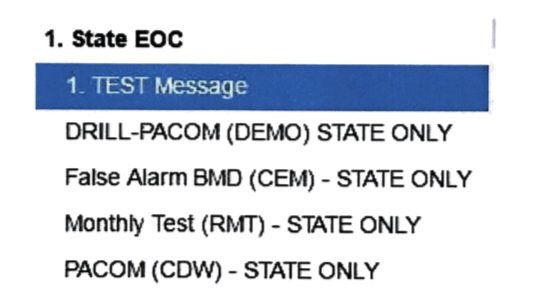
In January the citizens of Hawaii heard or received an alert stating:

BALLISTIC MISSILE THREAT INBOUND TO HAWAII. SEEK IMMEDIATE SHELTER. THIS IS NOT A DRILL.

It turned out to be a false alarm. There were a number of contributing errors and when you see the menu used to select the drill you can see how easy it was to confuse the options.

If you’re designing anything, use experts, it really makes a difference. If you’re creating content for online there are some simple rules to follow.

And if you get some entertainment value out of seeing other people’s UX mistakes, I recommend the Bad bad UX instagram account.


First Mover Advantage

It sounds like something from flatmate hell, where the first person to move into a shared house gets the advantage of choosing the best room, or from sport where the racer first off the starting block has an advantage.

In fact this business term originated in the game of chess, where there is a slight statistical advantage for white who has the first move.

In the business world it has come to mean the advantage gained by the first significant company into a new market. Very often the “first move” has some transforming aspect to it, or combines two formerly separate products or services.

One commonly cited example is Netflix, a DVD rental service that outmanoeuvred the incumbent video rental giant Blockbuster. By developing a huge supply of DVDs, a fast delivery service, and a very simply business model that could be explained online Netflix could take over the market for DVD rentals in the US.

Apple are also often mentioned, although they did not develop MP3, and were not the first to think of portable music players (I had a Sony Walkman way back), they combined the two into a device that people would actually want to use, and developed an online delivery model, iTunes, that has left the rest of the music industry scrambling.

But the first mover advantage is not a guarantee of success, in many cases the first mover incurs expenses educating users, or on R&D, or on building infrastructure but competitors can move in easily before the real gains have been made.

Despite the risks it is something of the holy grail for business seeking to innovate into new space, so this term often pops up at marketing strategy meetings.

It doesn’t always work, just as in running a race where someone can trail the leader and make a last minute sprint to win the race. If I knew anything about sport I could point to examples. So instead a business example; Spotify is now the world leader in streaming music, but it wasn’t the first to come up with the service. It beat out early rivals Napster and Rhapsody by winning the war for user numbers by a factor of at least 20. In the platform economy user numbers are king, beating out profits as a predictor of success.

Sometimes being a smart follower is better than being a first mover – especially in a long race with significant headwind.

Image running


Social Media Fail – How to Lose a Job in Two Tweets

Woman gets great internship at NASA.

Woman loses great internship in two tweets.

NASA withdrew their internship offer.

Ooops.

It’s the second tweet posted by Naomi that’s problematic. Because Homer Hickam isn’t kidding around, and he’s properly famous with a wiki page, an amazon page, and an IMDB entry.

There’s an almost-happy ending to this, apparently Naomi has apologised and Homer is trying to help her find a role in the aerospace industry. I’m betting she dials back on the sweary tweeting.

This isn’t the first time a celebratory social media post has cost someone their job, there was the day care worker in 2015, and the Cisco new hire in 2009.

How is this still happening?

I think there’s a trend that our work and private lives are blending, mobile phones have freed us from the office desk meaning that we are always contactable. I am contactable on a company mobile phone but I also have access to personal social media accounts on the same device. Work itself is less hierarchical and more informal. When one of my 20-something-year-old colleagues made a significant error on social media, the reaction of my boss was that he “wasn’t fully socialised yet”. She might be on to something. For anyone entering the workforce now there’s a period of adjustment and that might be getting harder to negotiate as the gap between popular or youth culture and work culture grows.

I’m quite bad at swearing, as in I rarely do it, but I recognise the cathartic effect it has, the great release of tension following a good swear. But it’s not what I want to hear at work, especially not directed at me.

If you talk about the company who just hired you on social media, you are in some way representing them to your followers. Three tips to avoid this;

  1. Celebrate on social media – and try to sound like you want to work there
  2. Imagine the CEO of the company reading your post – before you post
  3. Save the rants, expressing your fears, and the swearing for private channels.

Maybe as a forth tip: use Google to check who someone is before telling them to suck any part of your anatomy.

Everyone looking for jobs/internships works really hard to get through the process, so this must be hugely disappointing. One day our work culture might be closer to the social media culture and all of this might be accepted, until then play nice and remember what you post online is permanent and public.

Upselling

Upselling is the practice of offering the customer a little more than their original purchase request. The most well-known example is probably the McDonald’s “would you like fries with that?”, in fact whatever you order at McDonald’s you’ll be offered one more thing – even if you’re ordering via a digital screen.

It’s a normal part of service in the US, but it’s less common here in the Netherlands, and there have been times here where I’d have welcomed a little upselling rather than trying to catch a waiter’s eye to order water.

But last week I had a sales experience where upselling almost lost them the sale. I wanted a small item, a nail buffer. I imagined the price would be in the 5-10 euro range. But I couldn’t just buy the buffer, I had to buy a set… I tested the hand cream, it smelt good. I agreed to by the set, my decision helped by it being on sale. At this point I’ve agreed to spend 3.5 times my initial planned spend.

But then they tried to upsell again, for twice what I’d just agreed to spend I could have a body scrub and a moisturiser – telling me that I had “skin discolouration” as part of the sales pitch. I declined politely. Then at the cash register, while I was standing with the money in my hand, I was asked again – I was so tempted to walk.

But on reflection I think the hard sale is one of the reasons this company is being forced to offer big discounts on their products. The Dutch are a bit allergic to this approach.

Image  french fries via pixabay

In Praise of Short Meetings

There were three messages: safety, inclusion, company performance. In that order. It was all over in about 15 minutes, and we were asked to chat to our colleagues and get to know someone new.

I wasn’t what I expected from a company meeting about annual results, and I wasn’t the only one, some colleagues who are also in their first year with the company were also surprised.

It was brilliant. It was effective. Everything about it spoke of the company’s priorities, and there was lunch.

When was the last time you joined a meeting that covered the promised agenda, inspired you, gave you lunch and finished on time?

Three things to think about when planning a meeting

What is the purpose of the meeting?

Meetings can have different purposes – informing colleagues, making decisions, problem solving, or consulting. Try to keep your meeting to just one purpose, it will make the next questions a lot easier.

Who needs to be in the room?

Steve Jobs famously asked people not specifically needed in a meeting to leave. That makes sense for consultative or decision-making meetings where increasing the number of attendees slows both processes down. However if your meeting is about informing people or problem solving the numbers matter less, and for informational meetings the audience will be somewhat self-selecting.

What is the minimum content?

A meeting is not the place to provide really in depth reporting, people can’t absorb and work with detailed data in a 30 minute time-slot through which everyone will be speaking. So go minimalist on what you present – and provide the resources/data/files later. If you’re using powerpoint create high impact slides and use appendices for the detail. The meeting I mentioned above did use powerpoint with key figures – 2 or 3 data points at most. We all walked out understanding the direction of the company and with the priorities clearly impressed on us.

And one last sneak question; do you really need a meeting? Many decisions can be made without putting an hour on everyone’s agenda. This is one area where time is money and it’s rarely factored into project costs, there are tools out there to help you measure the cost of time spent in meetings, and other tools to help you manage meetings better.

Go for a shorter meeting, your team will thank you for it.

Image: stopwatch via pixabay